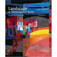
I'm loving this book. This has FINALLY gotten my creative juices flowing. I was going to say it has finally gotten my lazy butt off the couch and into my studio, but then I remembered it's not that I've been physically lazy as much as uninspired to start on new projects. Big difference. This book by Ineke Berlyn is chock full of COLOR and DESIGN help, and so much INSPIRATION. I guess this is the direction I need to head in. I've been fascinated for a long time by the idea of taking a photograph and interpreting it in fabric, but it's NOT EASY for me. I struggle and struggle because I'm so LITERAL. Abstract does not enter my creative vocabulary very often, and when it does it's usually not intended. I get hung up on DETAIL. But I LOVE the way these illustrations look. The color. The simplicity of the design. So I decided to play a little yesterday and this is what my work space looked like when I started...notice the book opened to my 'inspiration'...

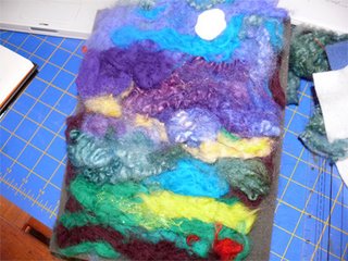
I had some wool roving so I started by interpreting one of her designs. I chose my colors, laid them out on my pad and started needlepunching. As I got closer to the end, (the place where DETAIL comes in), those demons started rushing in...that voice in the back of your head that says, "that looks stupid", "what's it supposed to be anyway?" and the other voice saying VERY LOUDLY "it doesn't have to BE anything, this is only FOR FUN" "Have fun!!!" So I did. I just let go and started loving the colors and the feeling of it...so soft...and the design is fine. I decided I didn't like the moon, so that ended up on the floor...

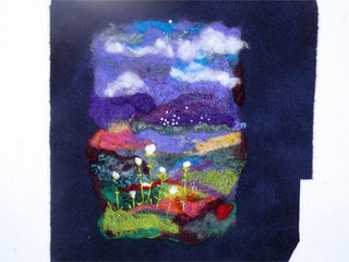
And in the end:

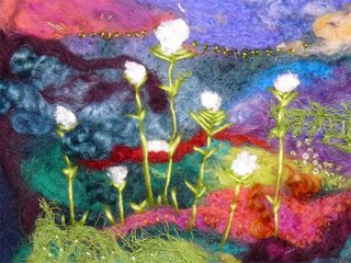
This is how it finished. With a detail shot:

Needlepunching is so cool. It's very sculptural, three dimensional and because of that you can accomplish depth, not by shadowing as you would on a flat surface, but by directing the needle into the fibers a certain way. And when you blend them all together...I turned my masterpiece over at one point

and saw the back...beautiful!
These were done by my friend and fellow Frayed Edger Kate last fall. You can see the sculptural possibilities with these guys. Aren't they funny?! Endless possibilities.


5 comments:
Beautiful work, Kathy!
Kathy, your piece is lovely. I have the same problem - too literal and too detailed. I should probably consider getting the book. I'm not particularly into landscapes, but do you think the book would be beneficial as a general design tool?
Kathy, your new work is wonderful! I just got that book and I agree with you, it is fantastic. I also have a problem seeing abstractly and get hung up on the details. As for the critic, I have a tiny (1"square) box that I put her in when she gets annoying and close the lid!
Beautiful! It would be a difficult call for me to choose between the front or the back.
Your little landscape is beautiful!
Post a Comment